What are the best fonts to use when designing a business card?
When it comes to business cards, you only have a small amount of room to create a significant impression. There are so many different ways to cut through and connect with a lead, but sometimes, the answer is as simple as selecting the right font-type. With thousands of styles to choose from, it’s important to pick the one that will help define your business.
Business cards have been around for centuries. You can find another article here about how to make a business card that people won’t throw away, because we’ve already established that most standard business cards often end up face down in the trash can.
So how do you ensure your card stays out of the trash and in people’s heads? It’s easy. And it all starts with choosing the right font for your business card. A good logo goes a long way, but the right typography is hard to overlook. Your business is given an identity when its name is said aloud—the typeface you choose helps to establish that identity.
You only get one chance to make a first impression. Make sure it’s not the wrong one. In this case, you only have 3.5 x 2 inches (give or take) to make that impression—which means there isn’t a lot of room for error. So, you’ve got to make it pop. You need to be sure you can capture your audience’s attention within a small space and timeframe. Your business card is like an elevator pitch, only smaller.
While there are general principles involved in designing an impactful business card, it’s important to note that there aren’t any strict rules to abide by.
With that in mind, if you’re hoping to create something that reflects your brand and establishes its identity, there’s a few tips and tricks to keep in mind when choosing the best font for your business cards design.

Not all fonts are the same
The best font for your business card isn’t a ‘one size fit’s all’ proposition. If anything, the best font for your business is the one that you feel represents your brand and connects with your audience. However, that’s not to say there isn’t a strategy associated with choosing the right typeface; your approach will depend on what you want your typographic style to be. It’s also important to keep in mind any existing typography being used in current marketing material. You don’t want your business card to stray too far from what currently exists within the branding (unless, of course, you’re re-branding, then this is a different story!).
So, you want a clean, sleek, and modern feel to your business card?
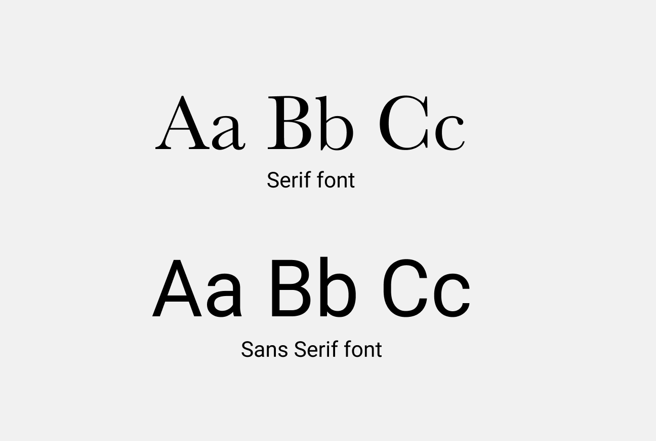
Sans serif is probably the font for you. Sans serif meaning ‘without’ the decorative lines at the end of each stroke work best if you want your business card to be easy to read. Combining candor with contemporary aesthetics, sans serif fonts like Arial, Helvetica and Myriad Pro are clean, simple, and can service any kind of business—from technology to design—making this standard font a safe choice for your business card.
If you want a more classical approach, serif is the one for you.
Serif fonts are ideal if you want to convey a sense of reliability and classicism. Elegant fonts such as Times New Roman, Georgia, and Baskerville, are steadfast options. However, some serif fonts used in smaller font sizes can be hard to read, so choose wisely. Remember—a great business card is easy to read and hard to forget!

What about script fonts?
Script fonts are arguably the most ‘human’ of all typefaces. After all, the cursive strokes and designs are created with human-like scripture in mind. When used correctly, script fonts, like Dancing Script OT, can be eye-catching and elegant. However, they’re difficult to read in small sizes and in lengthy sections of text.
Size matters
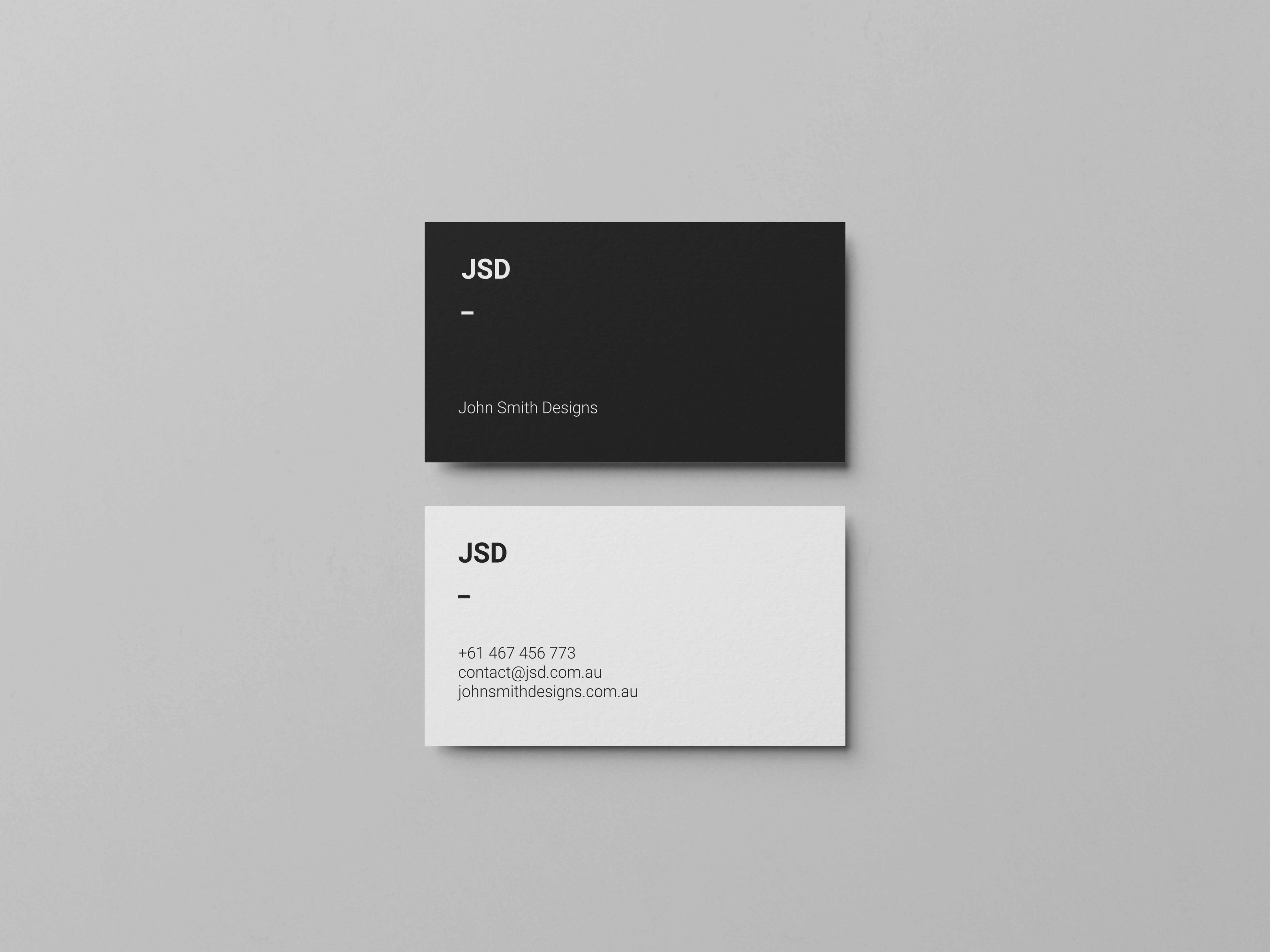
When designing your business card, it’s probably best to narrow your selection to two-three fonts. Larger texts, like the business name, or your full name, should be between 10pt-16pt. Any other information on your card, like your contact details, social platform handles or anything else should appear in a smaller size of a different typeface. The secondary font should probably sit around the 8pt mark but depending on how much space you have to play with will depend on the chosen point size. Remember, some typefaces can appear smaller than others, even if they are the same size.
Less is more.
Unlike flyers and seasonal messages which can change typographic styling depending on the campaign, time of year, and content—but your business card is here to stay, so keep it simple. There isn’t a lot of space for people to get lost, but that doesn’t mean it’s hard to lose your way around a business card! Avoid pairing fonts that look similar. Sometimes it’s enough to just change the weight of the same font to create a contrast that helps the text fields stand out. Placing too many styles on your business card can create confusion—and we don’t want that!
If you’re looking to lean on our expertise—or you don’t have the skills or experience to design your own business card—get in touch with us today or call 1300 663 120. We offer a team of in-house designers, ready and waiting to bring your brightest ideas to life (now that you’re an expert on business card design!).


