What are some tips for designing an eye-catching flyer?
Whether you’re a running a restaurant, a gym, an owner-operator business like gardening or electrical work, or even a local garage sale, a well-designed and eye-catching flyer is the best way to ensure your marketing efforts get 'off to a flyer'.
That’s because a flyer or pamphlet is often one of the first touchpoints that a prospective customer will engage with.
Flyers are particularly effective for driving awareness: they’re an excellent way to articulate a service, highlight a new offering, or showcase a series of updates you’ve made to your business.
If you’re looking to do exactly that—drive awareness and drum up new business—there are proven tips and techniques that help to convert people with casual interest into customers. After all, great marketing doesn’t happen by accident.
At Discount Printing, we’ve designed and produced hundreds of thousands of highly effective marketing flyers and pamphlets for all types of businesses. Today, we share 11 proven secrets for success we’ve picked up along the way.
1. Give people clear direction on what to do
While it’s hard to establish hard and fast statistics, current estimates suggest the average person is exposed to somewhere between 6,000 and 11,000 marketing messages every single day. If you’re lucky enough to cut through the clutter and connect with someone—and hold their interest even for only a few seconds—your flier needs to achieve two things immediately:
- Tell them about your service or offering, but perhaps more importantly…
- Tell them what they need to do next.
Are they picking up the phone and calling you? Visiting a website? Scanning a QR code? Redeeming a voucher? Coming into a physical store?
A good call-to-action (the instruction that tells people what to do) should be:
- Clear (the more straightforward and obvious, the more likely a conversion)
- Singular (too many will distract and dilute the one instruction; see the above point)
- Easy: try to articulate your call-to-action in a way that sounds like as little effort on the customer’s behalf as possible.

2. Use high quality, relevant photography
The old saying suggests that a picture tells a thousand words. And when you’re designing a flyer, in many cases, the less written text you have, the better. (Pro tip: most people tend to scan things rather than actually read them, so less text makes it easier for potential customers to get the key messages, quicker).
The important thing to remember here is ‘high quality’. Don’t let your photography—which should be a focal point and highlight of any flyer—become a pixelated and distracting letdown. Check that your images meet the required size and quality properties.
It’s true that a picture tells a thousand words, but a low-quality image says one thing loud and clear: ‘lack of attention to detail’.
3. Use design cues to segment the information
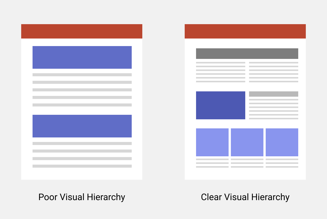
Once again: people prefer to scan the information on a flyer, rather than read word for word. There are many design techniques to help create clear ‘sections’ of information which are easier to consumer than a single, free-form bundle of information.
You might try:
- Different headline weights and sizes (e.g. bold, non-bold, italic)
- Bulleted lists for key information
- Break-out boxes
Try a technique called ‘the squint test’. Take a few steps back from your flyer design, literally squint your eyes until you can’t read the text, and see if you have a clear sense of the following:
- Which information is the most important
- A logical, reasoned order in which you should consume the messages
- An organic feeling for where your eye should move as you move through the information
- A clear call-to-action
- Distinct sections of information that clearly speak to different pieces of information (for example, an obvious difference between contact information and the menu of a restaurant)

4. Keep it interesting, but don’t get overwhelming
The human brain is hardwired to remember variance in a set of items much easier than if everything is uniform. When it comes to designing an effective flyer, that’s true to a certain extent.
Different fonts, graphics, colours, and images will help to create a compelling impression and catch peoples’ attention. But there is a point of no return. If you have too many different competing fonts—for example—the overall aesthetic of the design starts to feel conflicted. Too many voices in a conversation will ultimately make the message inaudible.
The key is to shoot for a reasoned balance. As a general rule of thumb, you should have no more than 2 or 3 different font styles, and any graphics or logos should subtly support the messaging of the flyer rather than compete for attention.
5. Use social proof (if you’ve got it)
Trust us on this one – we’ve experienced the power of testimonials firsthand. You simply have to try using them in your marketing and flyer design.
No need to waffle on with this one. Social proof is compelling, and it’s been proven time and time again. Whenever we engage with a service or buy a product, we’re likely to look for reassurance that someone else has done the same with positive results.
Using a testimonial in your flyer is a great way to quickly and clearly provide reassurance for prospective customers.
6. Write an interesting and memorable headline
Imagine you’re introduced to some new people at a party.
The first person tells you the basic, necessary information about themselves. Their name, where they live, and what they do for a living.
The second person does the same, but with a joke, or some word play, or an interesting anecdote, or a piece of trivia neatly intertwined with the standard information.
Which one do you think you’re more likely to remember?
Writing a great headline that grabs attention is an artform. While there’s no hard and fast rule, here are some key tips to grab peoples’ attention:
- Try to frame things for the benefit of the customer. Ask yourself, what will they get out of engaging with your event, service or offering. For example, rather than ‘Local garage sale’, you might try something like ‘Find the vintage t-shirt of your dreams!’
- Be surprising: swap in a substituted word in an expected phrase or saying. It’s catchy, and the surprise creates a valuable memory association. For example, a pizza restaurant might go with ‘The pizza de résistance’, which substitutes ‘pizza’ into the common phrase ‘pièce de résistance’, referring to a masterpiece.
- Get to the point. The ideal headline is about 6-8 words. Any longer and the headline will start to look out of place (especially if you’re using the right hierarchy of font weights in your design—see tip 3) and likely isn’t snappy enough in general.
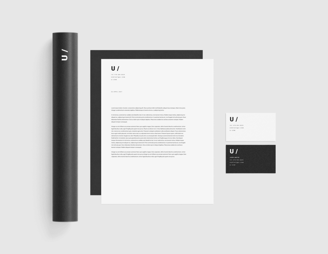
7. Keep things consistent with your other collateral
Your flyer might be the first port of call, but you likely hope to have many other interactions with your customer. A flyer typically sends someone to a website, or into a store, or somewhere else where you can process their business.
It’s important to have brand continuity throughout the entirety of the experience. In other words, your flyer design should look like all of your other marketing and branded materials. Use the same colours, the same fonts, the same logos.
Consistency breeds trust and familiarity. When your collateral—and service/offering—is consistent, people will more easily establish a rapport with your business. This is especially key for retaining customers and encouraging repeat transactions.
8. Print in high quality
Lastly, remember: you only get one chance to make a first impression. Low quality printing for first-contact marketing collateral is like showing up to a job interview in your pyjamas. It’s sloppy, and likely to be unsuccessful.
Choose a printer with years of experience, high quality stock and colour printing, fast delivery (after all, time spent waiting for printing is time spent waiting for customers), a proven track record for quality, and who supports completely custom artwork and design. If you’re looking for one, we can happily make a suggestion!
***
There you have it: eight tips to help you design an eye-catching and effective business flyer.
If you’re looking to lean on our expertise—or you don’t have the skills or experience to design your own flyer—get in touch with us today or call 1300 663 120. We offer a team of in-house designers, ready and waiting to bring your brightest ideas to life (now that you’re an expert on flyer design!).


