

'Print-ready' artwork is all about preparing your files in a certain way to ensure the highest quality outcomes for customised commercial print products.
The process of ensuring artwork is 'print-ready' involves a common set of industry standards, but they're only really common if you work—or have experience—in printing.
For everyone else, it's worth learning the basics. Submitting artwork that does not meet print-ready standards could result in a less-than-ideal final product, or requoting for a successful outcome.
Of course, different products may require specific considerations. Here, we’ll go through some of the universal basics including what the terms mean, and why each one is important.
General considerations for print-ready artwork
1. Bleed
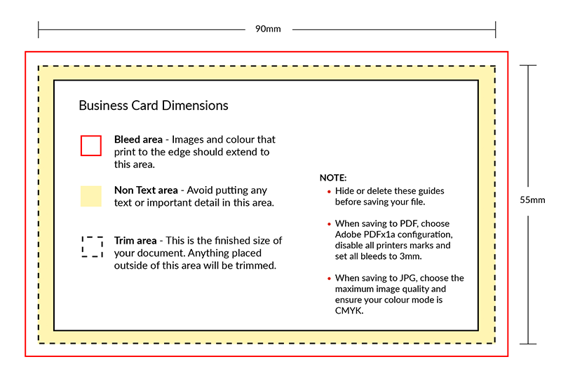
At Discount Printing, we require a ‘3mm bleed’ for print-ready artwork. In printing, bleed refers to a visual style where the colour extends all the way to the edge of the paper.
It’s easier to understand bleed with visual examples. In this case, we’ll use business cards:
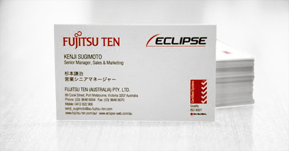
The Fujitsu card above is an example of no bleed, because there is no colour within the artwork that extends to the edge of the card.

This example, for Knox Audiology, features bleed on two sides, because the ink for the yellow strip extends to the very edges on two sides of the card.
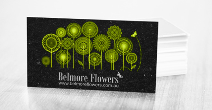
The final example shown above, for Belmore Flowers, is called a full bleed, because the ink coverage extends to the edge of the print product on every side.
How to prepare for a 3mm bleed:
n the example of the business card below, simply extend your artwork to the pink region of the design template—3mm all the way around— to ensure any images of colours cover to the edge of the finished printed card. 3mm bleed is designed to ensure there are no thin white strips on the edges of the card in the final product.
2. 1-up on a single page
‘1-up’ printing means that each printed page is a separate page within your supplied artwork file. This is particularly important in relation to brochure and calendar printing, for example. As a point of difference, ‘2-up’ printing involves two pages being supplied on the one page within the artwork file.
3. Nominate all colours as CMYK
When designing artwork, there are two main colour systems used to determine colours: RGB and CMYK. The differences between these systems are extensive and complex, but very basically, RGB is typically used in design that will primarily be displayed on a digital screen, while CMYK is used for print design. Before supplying final artwork, be sure to check the colour mode being used by your design application or software.
4. Ensure your file type is correct
We recommend using one of the following programs to develop your artwork: Adobe Acrobat, Adobe Illustrator, Adobe InDesign, or Adobe Photoshop. Ensure you create or submit your artwork as one of the following file types:
- PDF (our main preference for file types)
- TIFF
- JPG
- EPS
5. Use high resolution artwork and imagery
At Discount Printing, we request all artwork is supplied at a resolution of 300dpi or higher. ‘DPI’ refers to ‘dots per inch’. The higher the dpi number, the higher the dot density, and therefore the ‘sharper’ or clearer the image.
Artwork with a low dpi rate can print as blurry or pixelated. There are many ways to confirm the dpi properties of your artwork, depending on the software you choose to use. It’s relatively common information though and it should be easy enough to find—even simple programs like Microsoft Paint can provide dpi information.
6. Convert text to paths, curves or outlines
In this instance, ‘paths’, ‘curves’ and ‘outlines’ are relatively interchangeable. Each term refers to the process involved in transforming the text in your artwork into a graphic element.
Why is this important? It eliminates the potential for the font styling to change between submission and printing. Not all computers have the same font libraries. If a computer cannot find the exact font used in an artwork submission, it will replace the font with the closest related style, which will alter the look of the overall artwork.
If the text in the artwork is converted and saved as a graphical element, or image, it cannot be changed. ‘Create outlines’—or similar—is a common function in the Adobe suite of design programs.
Our print-ready checklist at Discount Printing:
Now that you’re familiar with the basic terms and practices required in creating ‘print ready’ artwork, here’s a handy checklist to ensure your submission is ready to go:
- 3mm bleed
- 100% scale
- 1-up on single page
- Convert text to paths, curves, or outlines
- Ensure images are 300dpi
- Nominate all colours as CMYK or Pantone
- If you are mailing your material, please include a colour or a black and white proof copy of your file, including all fonts, scans, and linked items
Still need a hand? We’re here to help!
Get in touch now to arrange for one of our in-house design specialists to construct the artwork for you!